Design Like the Pros
7 designers of the 2018 Richmond Symphony Designer House offer home design tips

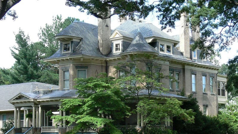
As a top fundraiser for the local orchestra, Richmond Symphony Designer House, set every other year in a different historic home, brings in professional designers to decorate individual rooms. Each designer has license to treat the assigned space as a clean slate, from painting walls to adding furniture, light fixtures and accessories (with occasional restrictions, like hand-painted walls that can’t be covered or a chandelier that shouldn’t be moved). Writer Martha Steger asked the designers for decorating tips.
#1: Rick Popio of Outdoor Lighting Perspectives
“You want to highlight your architectural features – including the archway as you come out of the kitchen at the back of this house – without calling attention to your light source. Keep in mind that greenery around the house can also be a focus – such as the crepe myrtle in the back yard.”
#2: Kathy Corbet of Kathy Corbet Interiors
“A foyer is essentially a landing spot with a mirror, a place to sit down and take off or put on your shoes. A great light fixture is a good idea, and the nine-light chandelier I chose to hang from the medallion in the foyer ceiling provides a lot of light for the dark wood that reaches up the stairs.
#3: MelissaMathe of Melissa Mathe Interior Design
“Keep the end-user, their hobbies, and their needs in mind when designing a space. Parts of a person’s life can be integrated to create personality. In my case [the middle bedroom at top of stairs to left], the end-user could be a young adult; I placed a desk that can be used as a vanity with spaces for jewelry or used for other purposes. I also integrated art, as we have a plethora of amazing art, reasonably priced, in this area. Among the artists I chose, Maria Driscoll uses very vibrant colors for her florals. Other artists include Leslie Archer, Camerson Hackett, and Kate Snidow.
#4: Kelly Brown of Kelly Brown Interiors
“Use leggy or built-in furniture for a lighter feel in small spaces. With the long, narrow sunroom upstairs, we built a long, stained white-oak floating bench with an inset cushion – the bench has thin legs to appear to be floating in the space. It runs wall-to-wall to capitalize on the natural sunlight coming through those windows, making it inviting on a winter day to curl up with a book. We also brought in plants, as it’s an easy way to bring the outdoors inside and a good way to help clean the air. We worked with Great Big Greenhouse on the best plants for this spot.
#5: Moyanne Harding of Interiors by Moyanne
“I used the space in the master suite – including the bathroom and sitting area – efficiently, making sure not to clutter it. Edit your rooms now. Give the stuff to the kids or charities. This house is very grand so it’s not the best example of ‘less is more,’ but generally that’s a principle to need to keep in mind. You can still have beautiful things – it’s a nice feeling to purge stuff.” (Moyanne also owns a business, Estates & Consignments, that helps people scale down.)
#6: Georgia Kukoski of Closet Factory
“Organizing is key with smaller spaces [Holly Lawn’s very small bedroom closets are typical of its era]. The space to the left side at the top of the stairs – with windows overlooking the sleeping porch and the patio at the back of the house – was a storage area. I built a mirrored vanity in front of one window for unique storage of makeup and hanging jewelry – with a window treatment for that window. There will be a double bank of drawers and hanging spaces, some of them behind cabinet doors and some, open. Just getting started is the hardest part of organizing. Plan carefully for individuals’ inventories. When downsizing, for example, figure out where you’re going to store miscellaneous things such as vacuum cleaners, mop, broom, and other utility items.”
#7: Rick Friedrichsen of La Difference
“If you’re not into maintenance for porch or outdoor furnishings, a higher-end, rich dark brown wood called ipe or ironwood is great. Because this house has a large, wraparound porch, I could break up the space for design purposes. I chose two rocking chairs, a bench and a five-foot dining table – all ipe – among other pieces. The dense, heavy wood silvers as it ages the way teak does so you need to keep in mind when decorating that the color of the wood will change with age – unless you want to sand it and maintain its present brown color.”


