The 2019 Colors of the Year from Top Paint Brands
Go ahead. Take your pick

Top paint brands have selected their 2019 colors of the year and, at first glance, they couldn’t be more different. On the one hand, we have an earthy desert tone in Cavern Clay from Sherwin-Williams. On the other, we have a sophisticated cool gray from Benjamin Moore. So, how do you decide which to use in your own design? These are some of the best and most intriguing options for everything from big commitments to smaller details.
SHERWIN-WILLIAMS: CAVERN CLAY
Sherwin-Williams describes their color selection as: “Ancient, yet fully alive. Bohemian, yet totally refined.” It is similar to popular terra cotta shades and works well on accent walls or for an entire room. Because Cavern Clay falls between orange and brown, it’s on the warm side of the spectrum and can create a cozy yet energized mood where applied. It’s a great complement to natural materials, Southwestern themes and indoor plants.
If you’re painting a very small room, you might want to steer clear of this shade. It tends to pull the walls closer and may make the room feel confined. It may also stimulate appetite, so if you want it in the kitchen, consider using it on an accent wall or backsplash.
BENJAMIN MOORE: METROPOLITAN
Benjamin Moore describes Metropolitan as: “Calm, composed and effortlessly sophisticated.” It is a cool, simple gray tone inspired by modern design, neutral trends and the goal of restoration in the home. This color can serve as a backdrop in nearly any room, from the kitchen to the bathroom and especially the bedroom, where we need calm most. You can use it on walls, in furniture and as linens or rugs. Consider layering it with other grays for a tone-on-tone look.
Though Metropolitan is extremely versatile, it can seem cold and unfriendly in dark spaces. Its character is best captured in rooms with lots of natural light.
BEHR: BLUEPRINT
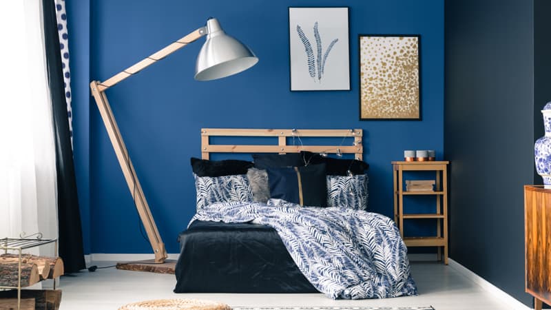
According to Behr, “Blueprint creates a space where you can build your own reimagined life.” It is a rich, moody blue that fits into many design concepts. And Behr showcases it in palettes of every tone, from monochromatic to earth tones and pastels. This versatility means that it’ll be easier to incorporate Blueprint into your home design without making drastic changes. Use it as an accent wall, for details like furniture and even on your home’s exterior!
On interior walls, Blueprint can be quite dark. If you’re considering painting an entire room, know that this color will make it seem smaller and cozier. You might desire this for a bedroom or dining room, but perhaps not for a kitchen or living room.
PPG PAINTS: NIGHT WATCH
PPG Paints says their color, Night Watch, “is a rich, luxurious and classic shade of green allowing spaces to emulate the feeling of lush greenery.” You can incorporate it in velvety furniture, in rich decor, or in your linens and rugs. It also works beautifully as an accent wall or as the all-over color in an intimate space like a bedroom, study or dining room.
For an entryway that pops, consider using Night Watch on your front door. Green is a stabilizing color that will anchor your home’s appearance and echo feelings of renewal and calm.
Lauren White is a reporter for HomeAdvisor, an online marketplace connecting homeowners with trusted service professionals to complete home projects. Visit HomeAdvisor.com
(c)2018 HomeAdvisor
Visit HomeAdvisor at www.HomeAdvisor.com
Distributed by Tribune Content Agency, LLC.


